When a piece of work is evaluated for an art show, one of the key features most judges look for is a healthy range of values. For a number of judges, this is the most important aspect of an artwork.
Just what are values in terms of an artwork’s presentation?
In this context, the term “value” refers to the lightness or darkness of a given area of an image. This isn’t about the color of the area. It’s about its relative lightness or darkness compared with other aspects of the painting. For that reason, value is also called “lightness” by some.
Let’s look at Turner’s painting “Dutch Boats in a Gale”.
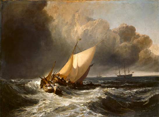
If you imagine this as a black-and-white image, you’ll see that there is a full range of grays represented. It goes from the nearly-pure-white of the tops of the waves, through the softer white of the sail, to the medium-dark of the clouds, all the way down to the near-pure-black of the shadows in the waves.
In general you want to avoid pure white or pure black. Those aren’t colors usually found in nature. You want to aim for a black which is made up of dark colors – dark blue, dark red, and so on. You want your whites to have a tinge of something in them – yellow, green, whatever is appropriate.
The human eye is generally drawn to the brightest spot in the image. In this case the eye is swept in by those frothy white waves to the bright sail, which is the center point of the image. Then from there the eye flows back toward the ships in the distance. So the use of values also influences how the eye moves through the image. This is also key.
An artwork is like a book laying open to be read. Where does the eye start? Where does it flow? Values strongly influence that, along with shapes and forms, which we’ll cover separately.
Let’s look at another artwork. This is “Christina’s World” by Andrew Wyeth.
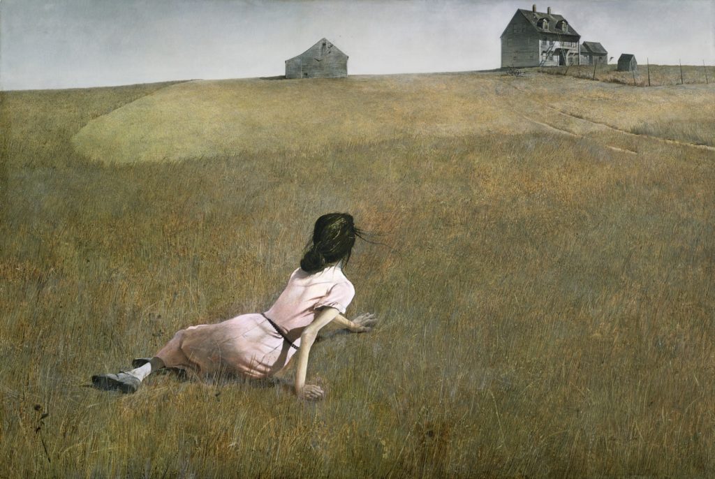
Where does your eye go first? To the brightly lit young woman. Note her shoulders are not pure white, but they’re nearly white. The eye then follows the woman’s gaze out toward the house, which is much darker. The door is nearly black but it isn’t quite black. Between those extremes, there’s a full representation of values here.
Sometimes in photography images can get “blown out” where the whites are too white, or it can get underexposed where the blacks are too black. Those are tricky challenges to fix. To show a well balanced photo, here’s work by one of our BVAA members – a true master – Al Weems. He wins prizes frequently at our shows. This artwork won first prize at a recent show. Judges often praise his exceptional technique with his range of values.
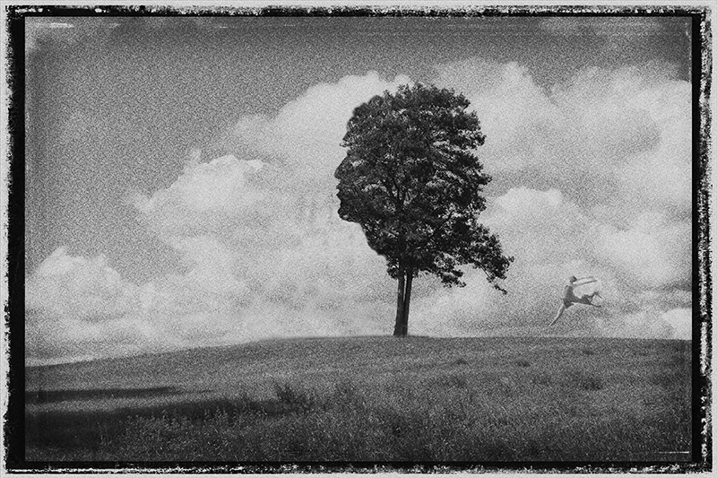
This image also shows that rules always have exceptions. In this image, it’s the central dark tree which tends to draw your eye first, because no white area “stands out”. Al carefully balanced the whites so that none competed with that tree for the focal spot.
To review again, values aren’t necessarily about black and white. Rather, values are about the lights and darks. It’s often just easier to think about values by thinking about an image in black and white. That makes all the shades of gray become easier to visualize.
But what about pop art styles, which are more of a cartoony / stylized presentation? Let’s look at The Great Wave off Kanagawa by Hokusai. This is a woodblock print, so by necessity it was done with only a few ink colors. Even so, Hokusai was able to get a range of values to be represented, from the light end down to the dark end.
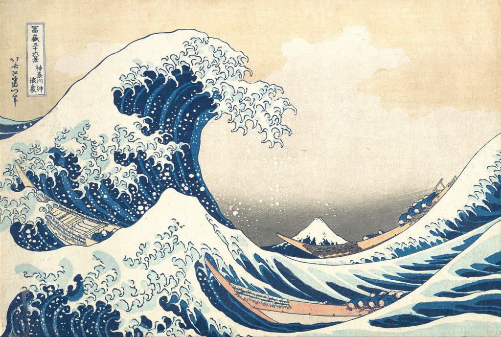
There is definitely a sense here that it’s an abstraction of the scene, rather than a realistic version. The colors are bright and the light / dark contrast is emphasized.
But, even so, the whites aren’t glaring white. They don’t create a “solid field of empty”. There’s enough softness / tan in the white that the eye can move through it. The eye tends to be caught by the big area of light in the top left, and then the eye flows down through the wave, to the boat, and in to the white-topped mountain.
There are darks here but again, they’re a deep, deep blue, rather than a solid black. There’s texture and dimension there.
Now, it’s also fine to remember that there are always exceptions to rules. Let’s look at “Girl with a Pearl Earring” by Vermeer.
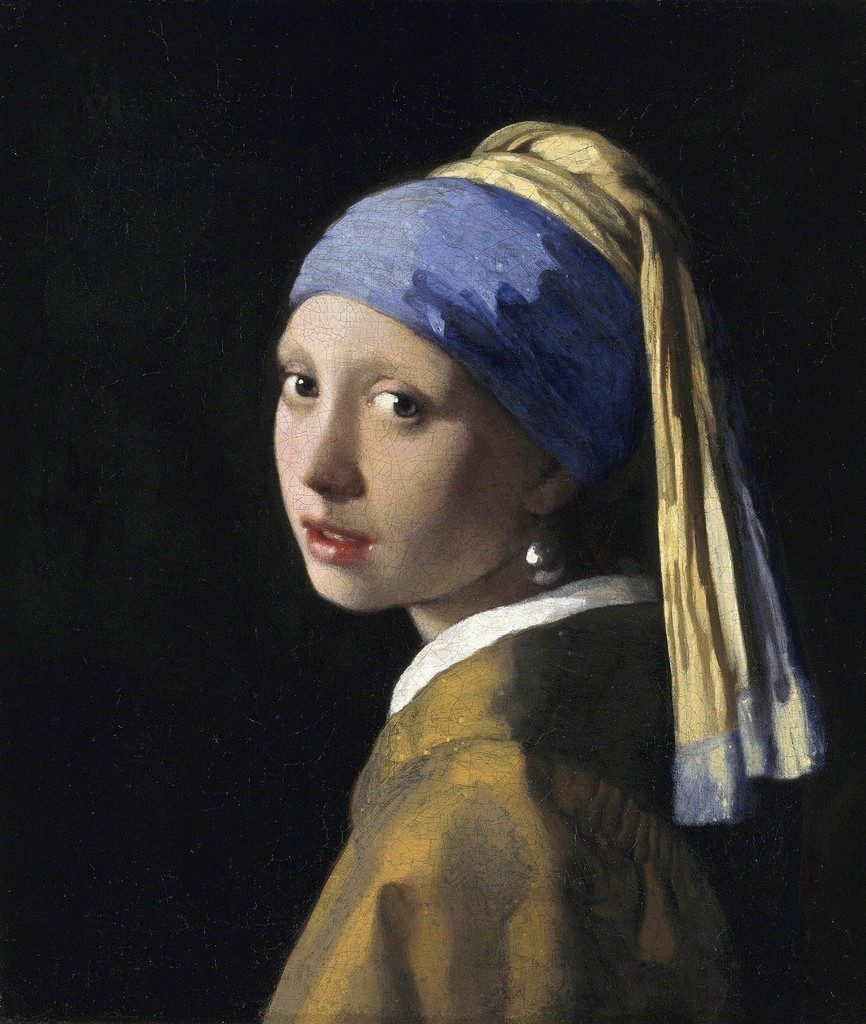
That background is fairly black. The collar is fairly white. Your gaze tends to go to her eyes first, because human eyes are what we naturally tend to look at. But then our eyes tend to go down to that white collar, which draws us along to the shiny earring. The darkness in the background fades away and becomes non-existent.
This background may look black on your screen, but it’s actually a gently textured dark-dark-brown so it’s not as sharp against the image. It lets the main image stand out better.
On the topic of values, though, you can see that the image still has a nice range of values here, from the lighter areas down through the darker ones.
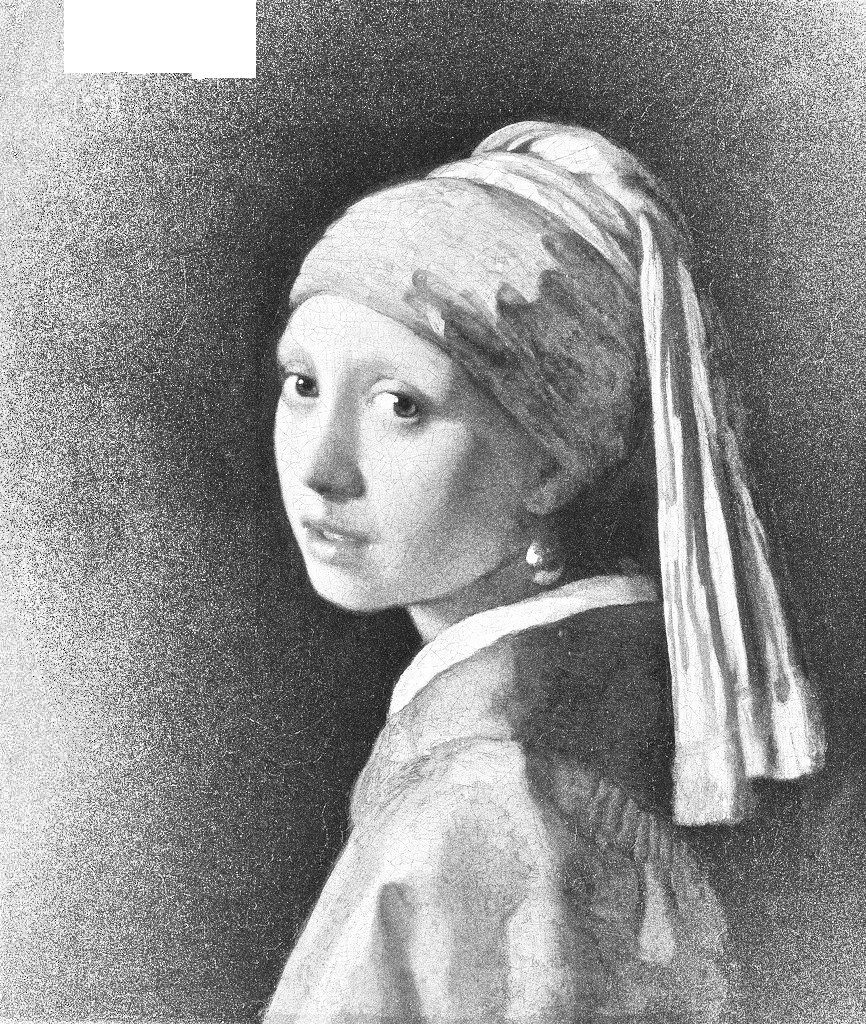
To show what I mean about the grayscale version of an image, here’s the above image converted to grayscale. The only area which ends up solid black is in the top left and that’s probably a result of the camera’s sensor. You can see how there are a wide range of values shown, from the bright light of the collar to the darker areas of the eye.
Try this with your artwork. Turn it into a grayscale version and see what happens. Is it still clear? Do areas get muddy? Is there a representation of all sorts of different shades of gray in it?
So, to summarize, if you’re painting, whether with physical paints or computer screens, think about selecting or mixing your paints so you create those ranges of values. Stop thinking about color for a minute. Think about the lightness or darkness of what you’re working with. Is there a good spread of values, from the lightest lights to the darkest darks and a range in between? Have the darks become too muddy so they’re hard to see? Have the lights become blown out and glaring? Is there enough of a range?
Also, think about how you’re using values to guide the eye. Is there a specific bright area which catches the eye and gives the viewer a starting point? Do the values then help guide the viewer through the image? An image should rarely be “stagnant”. It’s good to have some sense of where the eye should go as it moves around the image. Even with something which seems a single subject, like the girl above, there is still going to be movement of the eye as the eye takes it all in. What is that path? How do values guide it?
If you’re doing photography, learn your camera’s settings. If possible, have the display flash for you if it detects areas which have become solid white or solid black. That helps you to adjust the exposure to fix the problem. Sometimes it’s necessary to “bracket” the image – take multiple pictures at multiple exposures – to get the full range in a final image. The technology of HDR (high dynamic range) images does this automatically for you. If a picture has been taken where a region has been lost to all-white or all-black, it can be nearly impossible to get the detail back in that space. So it’s best to get the photo exposed properly in the first place, so it can then be worked with.
Here’s the Wikipedia page on values and lightness, with examples involving shades of colors.
https://en.wikipedia.org/wiki/Lightness
Ask with any questions – we’re happy to provide ideas!